
Measuring Fabry-Perot fringes#
This example shows how to measure Fabry-Perot fringes using the image processing features of DataLab:
Load an image of a Fabry-Perot interferometer
Define a circular region of interest (ROI) around the central fringe
Detect contours in the ROI and fit them to circles
Show the radius of the circles
Annotate the image
Copy/paste the ROI to another image
Extract the intensity profile along the X axis
Save the workspace
Load the images#
Note
The images used in this tutorial “fabry_perot1.jpg” and “fabry_perot2.jpg” are
available in the tutorial data folder of DataLab’s installation directory
(<DataLab installation directory>/data/tutorials/).
Alternatively, you can download them from here
and extract to the folder of your choice.
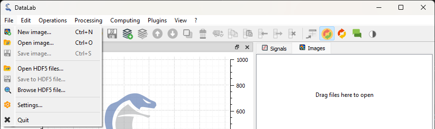
First, we open DataLab and load the images from the menu file “File > Open Image…”,
with the  button in the toolbar or by dragging and dropping the files
into DataLab.
button in the toolbar or by dragging and dropping the files
into DataLab.
Open the image files with “File > Open Image…”, or with the button in
the toolbar, or by dragging and dropping the files into DataLab (on the panel on
the right).#
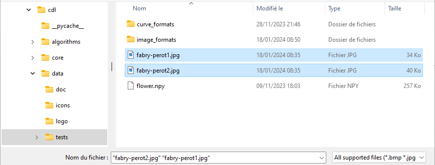
Go to the tutorial data folder in DataLab’s installation directory (or the folder where you placed the images), select “fabry_perot1.jpg” and “fabry_perot2.jpg” and click “Open”.#
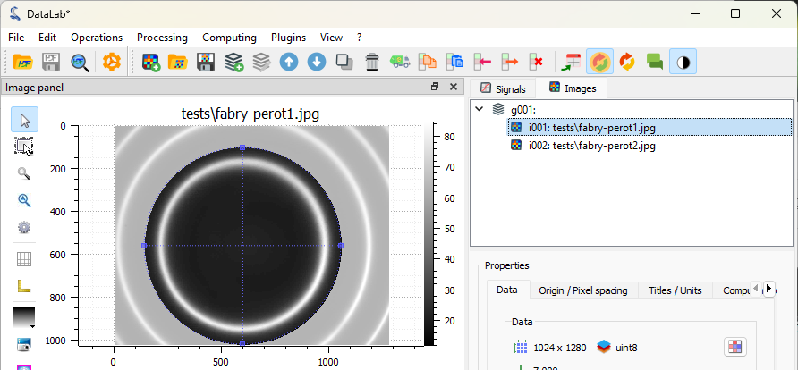
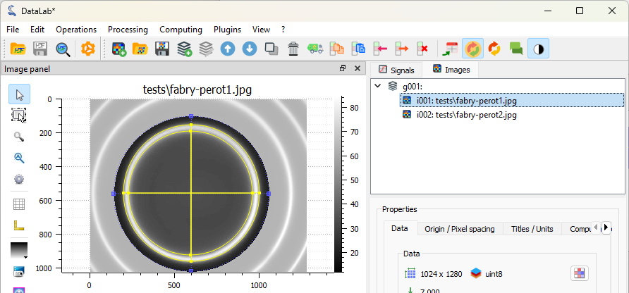
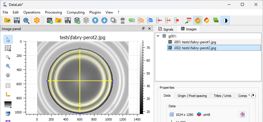
The selected image is displayed in the main window. We can zoom in and out by pressing the right mouse button and dragging the mouse up and down. We can also pan the image by pressing the middle mouse button and dragging the mouse.
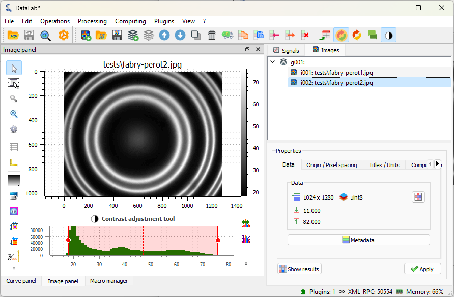
Images loaded in DataLab. Zoom in and out with the right mouse button, pan the image with the middle mouse button.#
Note
When working on application-specific images (e.g. X-ray radiography images, or optical microscopy images), it is often useful to change the colormap to a grayscale colormap. If you see a different image colormap than the one shown in the figure, you can change it by selecting the image in the visualization panel, and the selecting the colormap in the vertical toolbar on the left of the visualization panel.
Or, even better, you can change the default colormap in the DataLab settings
by selecting “Edit > Settings…” in the menu, or the  button in the toolbar.
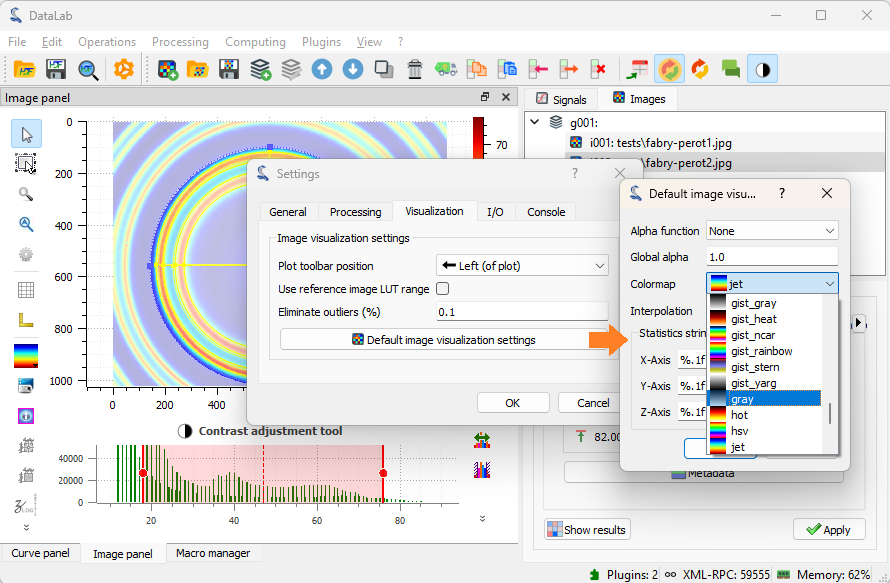
Select the “Visualization” tab, and select the “gray” colormap.#
Define circular ROIs and fit contours#
Let’s define a circular region of interest (ROI) around the central fringe. To do that, we firstly select the first image in the “Images” panel (if not already selected), then we select the “Edit graphically” tool in the “ROI” menu.
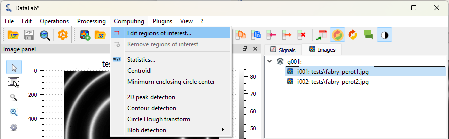
Select the “Edit graphically” tool in the “ROI” menu.#
This opens the “Regions of interest” dialog, that provides all the tools to define and edit ROIs. You can define ROIs graphically or via their coordinates. You can define multiple ROIs on the same image, and even combine them using boolean operations (union, intersection, difference).
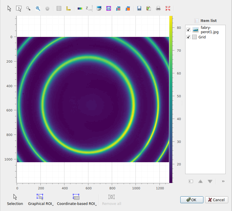
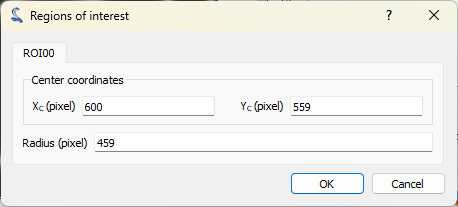
The “Regions of interest” dialog opens. Click “Add ROI” and select a circular ROI. Resize the predefined ROI by dragging the handles. Note that you may change the ROI radius while keeping its center fixed by pressing the “Ctrl” key. Click “OK” to close the dialog.#
We choose to define a circular ROI graphically. To do that, we click on the “Graphical ROI” button, and select the circular ROI option. We can now draw the circular ROI on the image by clicking and dragging the mouse: the first click is on one side of the circle, and the second click is on the opposite side of the circle.
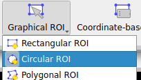
The option to graphically define a circular ROI.#
Once created, the ROI can be selected using the “Selection” tool, and moved or resized by dragging the ROI or its handles. In addition, you can change the ROI radius while keeping its center fixed by pressing the “Ctrl” key while dragging a handle.
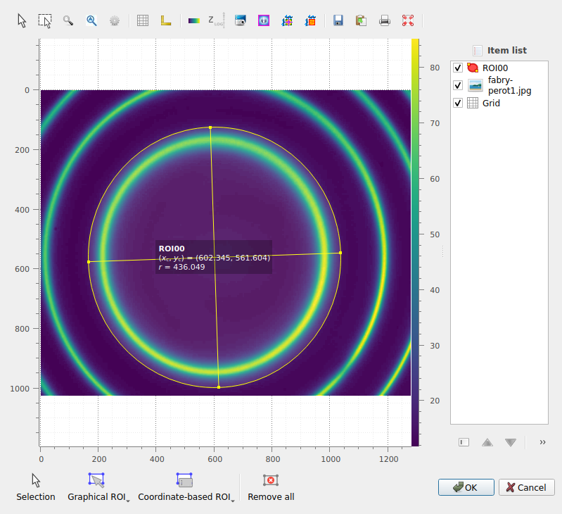
The circular ROI created appears in the image.#
Once you are satisfied with the ROI position and size, click “OK” to close the dialog. A confirmation dialog opens to ask you to apply the ROI to the image, and confirm its parameters. Here you can also choose to invert the ROI mask (i.e., select the area outside the ROI instead of the area inside the ROI): we do not want to invert the ROI in this case, so we leave the “Invert ROI” checkbox unchecked, and click “OK”. If you want to obtain the exact results shown in this tutorial, make sure that the ROI parameters are the same as in the figure.
The confirmation dialog.#
Once confirmed, the ROI is applied to the image. The ROI is displayed on the image, and the part outside the ROI is dimmed. Note that, internally, the ROI is defined by a binary mask, i.e., image data is represented as a NumPy masked array.
The ROI displayed on the image.#
Now, let’s detect the contours in the area inside the ROI and fit them to circles. To do that, we select the “Contour detection” tool in the “Analysis” menu. The contour parameters dialog opens: we select the shape “Circle” and click “OK”. Now you will see a “Results” dialog opening, that displays the fitted circle parameters. Click “OK” to close the dialog. The fitted circles are displayed on the image.
The “Contour detection” tool in the “Analysis” menu.#
The “Contour” parameters dialog.#
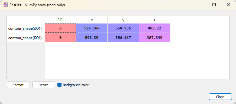
The “Results” dialog.#
The fitted circles are displayed on the image.#
Note
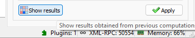
If you want to show the analysis results again, you can select the “Show Results”
 button in the “Analysis” menu, or the “Results”
button, in the Analysis panel located below the image list:
button in the “Analysis” menu, or the “Results”
button, in the Analysis panel located below the image list:
The images (or signals) can also be displayed in a separate window, by clicking on
the “View in a new window” entry in the “View” menu (or the  button in
the toolbar). This is useful to compare images or signals side by side, and allows
you to add annotations (cursors, labels, shapes, etc.) to the image or signal: the
annotations are stored in the metadata of the image or signal, and saved together
with the data when the workspace is saved.
button in
the toolbar). This is useful to compare images or signals side by side, and allows
you to add annotations (cursors, labels, shapes, etc.) to the image or signal: the
annotations are stored in the metadata of the image or signal, and saved together
with the data when the workspace is saved.
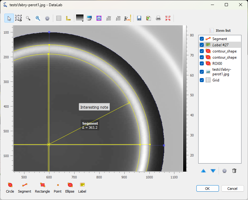
The image displayed in a separate window. The ROI and the fitted circles are also displayed. Annotations can be added to the image by clicking on the buttons at the bottom of the window. The annotations are stored in the metadata of the image, and saved together with the image data when the workspace is saved. Click on “OK” to close the window.#
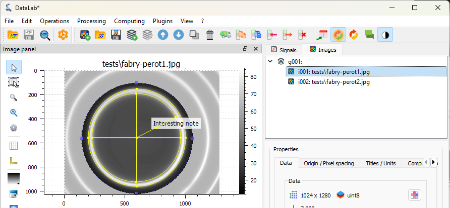
The image is displayed in the main window, together with the annotations.#
If you want to take a closer look at the metadata, you can open the “Metadata” dialog.
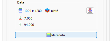
The “Metadata” button is located below the image list.#
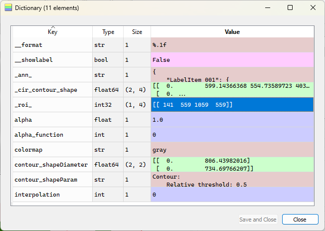
The “Metadata” dialog opens. Among other information, it displays the annotations (in a JSON format), some style information (e.g. the colormap), and the ROI.#
Now, let’s delete the image metadata (including the annotations) to clean up the image.
Select the “Delete object metadata…” entry in the “Edit” menu, or the  button in the toolbar, and answer “No” to the confirmation dialog to keep the ROI and
delete the rest of the metadata.
button in the toolbar, and answer “No” to the confirmation dialog to keep the ROI and
delete the rest of the metadata.
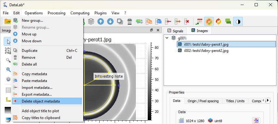
Select the “Delete object metadata” entry in the “Edit” menu.#
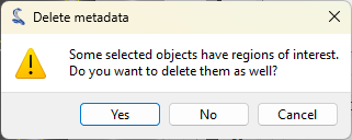
The “Delete metadata” dialog. Click “No” to keep the ROI and delete the rest of the metadata.#
If we want to define the exact same ROI on the second image, we can copy/paste the
ROI from the first image to the second image. The best way to do that is to use
the copy/paste option present in the “ROI” menu, or the  and
and  buttons in the toolbar: select the first image, then click on the “Copy” entry in
the “ROI” menu (or the button in the toolbar), then select the second image,
and click on the “Paste ROI” entry in the “ROI” menu (or the button in the
toolbar).
buttons in the toolbar: select the first image, then click on the “Copy” entry in
the “ROI” menu (or the button in the toolbar), then select the second image,
and click on the “Paste ROI” entry in the “ROI” menu (or the button in the
toolbar).
Note
Copying/pasting the metadata copies/pastes all the metadata, including the ROIs, but this would have the side effect of also copying/pasting the rest of the metadata.
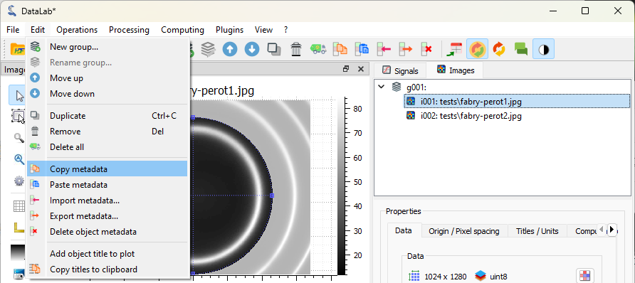
The “Copy” entry in the “ROI” menu.#
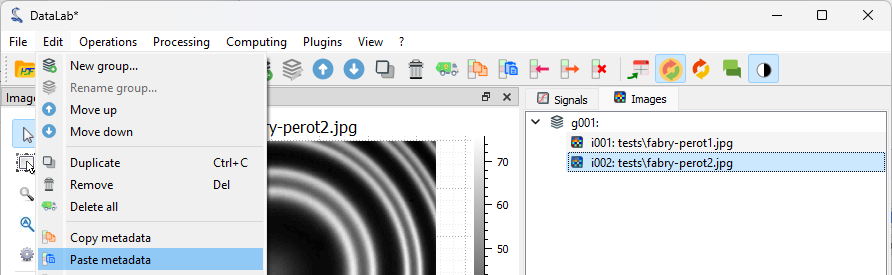
The “Paste” entry in the “ROI” menu, or the button in the toolbar.#
The ROI is added to the second image.#
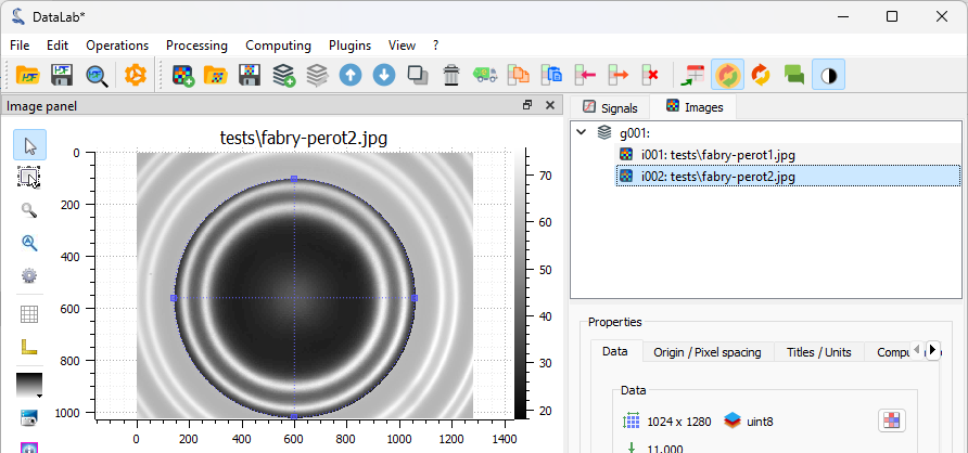
Select the “Contour detection” tool in the “Analysis” menu, with the same parameters as before (shape “Circle”). On this image, there are two fringes, so four circles are fitted. The “Results” dialog opens and displays the fitted circle parameters. Click “OK”.
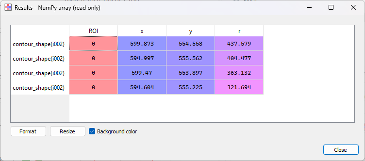
The “Results” dialog for the second image.#
The fitted circles are displayed on the image.#
Extract intensity profiles along the X axis#
Note
For the sake of simplicity (and because we want to compare two methods of extraction), we will extract the intensity profile along the X axis at the center of the image. In a real application, you would probably want to extract the radial intensity profile instead, which can be done using the “Radial profile” entry in the “Analysis > Intensity profiles” menu: this would be more relevant and straightforward to analyze Fabry-Perot fringes.
To extract the intensity profile along the X axis, we have two options:
Either select the “Line profile…” entry
 in the
“Analysis > Intensity profiles” menu.
in the
“Analysis > Intensity profiles” menu.Or activate the “Cross section” tool
 in the vertical toolbar
on the left of the visualization panel.
in the vertical toolbar
on the left of the visualization panel.
Let’s try the first option: select the “Line profile…” entry .
This is the most straightforward way to extract a profile from an image, and it
corresponds to the calc("line_profile") computation feature of DataLab’s API
(so it can be used in a script, a plugin or a macro). Select the “Line profile…”
entry in the “Operations” menu and the “Line profile” dialog will open, letting you
select the profile row (for a horizontal profile) or column (for a vertical profile)
on the image.
You can also enter the row/column number directly by clicking on “parameters…” in the
“Line profile” dialog.
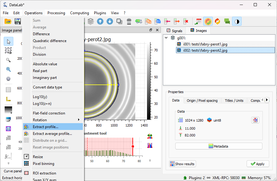
Select the “Line profile…” entry in the “Operations” menu.#
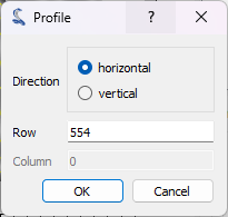
The “Profile” dialog opens. Enter the row of the horizontal profile (or the column of the vertical profile) in the dialog box that opens. Click “OK”.#
After clicking “OK”, the intensity profile along the X axis is computed and displayed in the “Signals” panel. DataLab automatically switches to the “Signals” panel to display the profile.
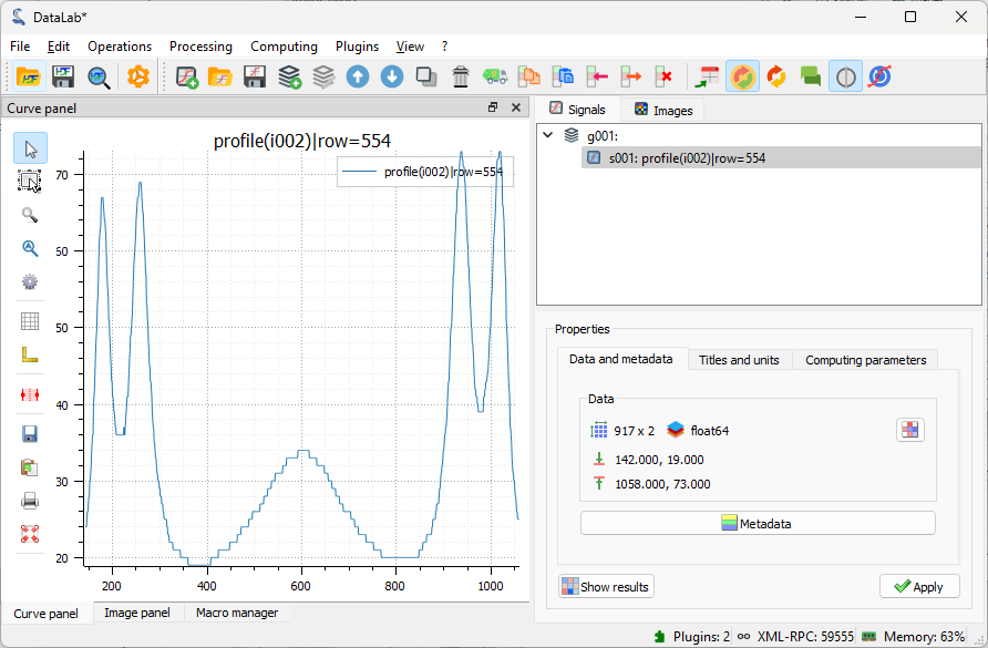
The intensity profile is added to the “Signals” panel, and DataLab switches to this panel to display the profile.#
If you want to do some measurements on the profile, or add annotations, you can
open the signal in a separate window, by clicking on the “View in a new window”
entry in the “View” menu (or the button in the toolbar).
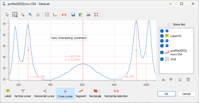
The signal is displayed in a separate window. Here, we added vertical cursors and a text label. As for the images, the annotations are stored in the metadata of the signal and saved together with the signal data when the workspace is saved. Click on “OK” to close the window.#
Now, let’s try the second option for extracting the intensity profile along the X axis,
using the “Cross section” tool in the vertical toolbar on the
left of the visualization panel (this tool is a
PlotPy feature). Before being able to use
it, we need to select the image again in the visualization panel (otherwise the tool is
grayed out). Then, we can click on the image to display the intensity profiles along
the X and Y axes. DataLab integrates a modified version of this tool which allows you to
transfer the profile to the “Signals” panel for further processing. Select the
“Cross section” tool in the vertical toolbar and click on the image to
display the intensity profiles along the X and Y axes.
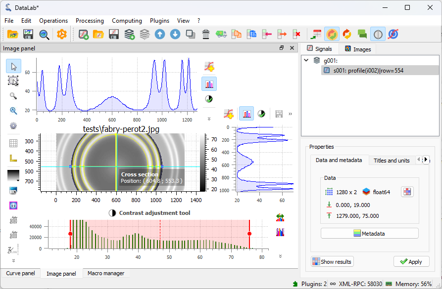
The cross section tool in the view panel. In the red circle, the button to activate it. In the blue circle, the button to transfer the profile to the “Signals” panel.#
Click on the “Process signal” button  in the toolbar near the
profile to transfer the profile to the “Signals” panel. The intensity profile is added
to the “Signals” panel, and DataLab switches to this panel to display the profile.
in the toolbar near the
profile to transfer the profile to the “Signals” panel. The intensity profile is added
to the “Signals” panel, and DataLab switches to this panel to display the profile.
Save the workspace#
Finally, we can save the workspace to a file. The workspace contains all the images and signals that were loaded or processed in DataLab. It also contains the analysis results, the visualization settings (colormaps, contrast, etc.), the metadata, and the annotations.
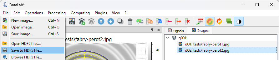
Save the workspace to a file with “File > Save to HDF5 file…”,
or the  button in the toolbar.#
If you want to load the workspace again, you can use the “File > Open HDF5 file…”
(or the  button in the toolbar) to load the whole workspace, or the
“File > Browse HDF5 file…” (or the
button in the toolbar) to load the whole workspace, or the
“File > Browse HDF5 file…” (or the  button in the toolbar) to load
only a selection of data sets from the workspace.
button in the toolbar) to load
only a selection of data sets from the workspace.